Using Basic Web Controls in Library Component Configuration Panel
You can use these basic web controls: Text Field, Checkbox, List, and Drop-down List, as variables in the configuration panel of a library component, to filter or sort the tables, charts, or crosstabs in the library component, or change properties of objects in the library component at runtime. This topic introduces how you can use basic web controls in the configuration panel of a library component for specific purposes.
This topic contains the following sections:
Using Text Fields
- Open the configuration panel of the library component.
- Do either of the following:
- From the Components panel, drag the Text Field icon
 in the Web Controls category to the position in the configuration panel where you want to place the text field.
 - Navigate to Home/Insert > Web Controls > Text Field, then drag the text field to the target location in the configuration panel.
- From the Components panel, drag the Text Field icon
- Right-click the text field and select Web Options from the shortcut menu. Designer displays the Web Options dialog box.
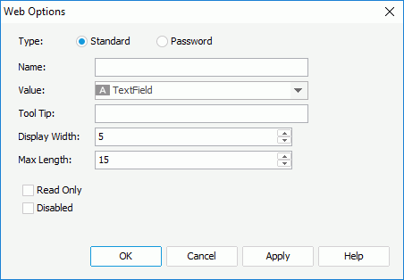
- Select Standard to use the text field as a normal text field, or Password to use the text field as a password box in which the typed characters display as asterisks.
- Specify the name, value for the text field in the Name and Value text boxes.
- In the Tool Tip text box, specify the tool tip you want to show for the text field. The tool tip displays when the dashboard users hover the mouse over the text field in JDashboard.
- Set the character width in the Display Width text box, and the maximum number of characters the user can specify in the Max Length text box.
- Select Read Only if you would like to set this text field to be read-only.
- Select Disabled if you want to disable the text field at runtime.
- Select OK to finish defining the web options of the text field.
- Specify the web behavior of the text field: Filter, Sort, or Change Property.
To apply the Filter web behavior
- Right-click the text field and navigate to Web Behaviors > Filter on the shortcut menu. Designer displays the Filter - Web Behavior dialog box.
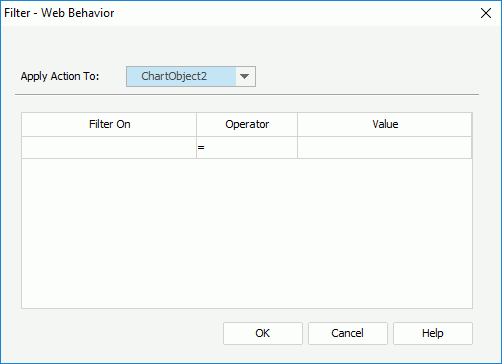
- From the Apply Action To drop-down list, select a data component in the library component the data of which you want to filter.
- In the Filter On column, specify the field on which to filter data. You can filter on a field included in the business view the specified data component uses, or use a web control that you add in the configuration panel of the library component to get the field name from the web control at runtime.
- In the Operator column, select the operator to compose the filter condition.
- In the Value column, specify the value of how to filter the field. You can select <Input...> and type the value in the text box, or select a web control to get the value at runtime. When you type the value, if multiple values are required, you should separate them with ","; if a value contains the character "," or "\", type the character as "\," or "\\".
- Select OK to accept the settings.
Then at runtime, when the dashboard users specify a value for the text field and select OK in the configuration panel, JDashboard filters the specified data component based on the condition.
- Right-click the text field and navigate to Web Behaviors > Sort on the shortcut menu. Designer displays the Sort - Web Behavior dialog box.
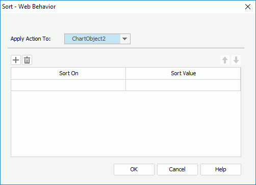
- From the Apply Action To drop-down list, select a data component in the library component the data of which you want to sort, or a group of a table in the library component to sort the groups in the group level.
- In the Sort On column, specify the field on which to sort data. If you select to sort a data component, you can sort on a field the data component contains, or use a web control that you add in the configuration panel of the library component to get the field name from the web control at runtime; if you select a table group, you can only use a web control to get the field name.
- In the Sort Value column, specify the order to perform the sort: Ascending, Descending, or select a web control to obtain the sort order at runtime.
- Select Add
 to add more condition lines and specify the sort conditions. To delete a sort condition, select it and select Remove
  .
. - Adjust the order of the sort conditions using Move Up
 and Move Down
  . The order determines the sort priority of the conditions at runtime.
 - Select OK to accept the settings.
Then at runtime, when the dashboard users specify a value for the text field and select OK in the configuration panel, JDashboard sorts the specified data component or table group based on the conditions.
To apply the Change Property web action
- Right-click the text field and navigate to Web Behaviors > Change Property on the shortcut menu. Designer displays the Change Property - Web Behavior dialog box.
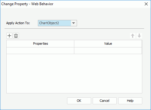
- From the Apply Action To drop-down list, select an object in the library component the properties of which you want to change.
- In the Properties column, select the property of the object you want to change.
- In the Value column, specify the value of the property. You can select <Input...> and type the value in the text box, or select a web control that you add in the configuration panel of the library component to get the value at runtime.
- Select Add
 to add more condition lines and specify the property conditions. To delete a property condition, select it and select Remove
  . You can also use Move Up
  and Move Down
  to adjust the order of the condition lines.
 - Select OK to accept the settings.
Then at runtime, when the dashboard users specify a value for the text field and select OK in the configuration panel, JDashboard changes properties of the specified object in the library component.
- Right-click the text field and navigate to Web Behaviors > Filter on the shortcut menu. Designer displays the Filter - Web Behavior dialog box.
![]() When you select a web control in the condition to define a web action, JDashboard should be able to retrieve a valid value from the web control at runtime in order to compose a valid condition; otherwise, nothing happens when the action is triggered.
When you select a web control in the condition to define a web action, JDashboard should be able to retrieve a valid value from the web control at runtime in order to compose a valid condition; otherwise, nothing happens when the action is triggered.
Using Checkboxes
- Open the configuration panel of the library component.
- Do either of the following:
- From the Components panel, drag the Checkbox icon
 in the Web Controls category to the position in the configuration panel where you want to place the checkbox.
 - Navigate to Home/Insert > Web Controls > Checkbox, then drag the checkbox to the target location in the configuration panel.
- From the Components panel, drag the Checkbox icon
- Right-click the checkbox and select Web Options from the shortcut menu. Designer displays the Web Options dialog box.
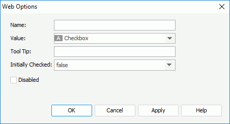
- Specify the name, value of the checkbox in the Name and Value text boxes.
- In the Tool Tip text box, type the tool tip you want to show for the checkbox. The tool tip displays when the dashboard users hover the mouse over the checkbox in JDashboard.
- Set Initially Checked to true if you want the checkbox to be selected by default.
- Select Disabled if you want to disable the checkbox at runtime.
- Select OK to finish defining the web options of the checkbox.
- Specify the web behavior of the checkbox.
Using Lists/Drop-down Lists
- Open the configuration panel of the library component.
- Do either of the following:
- From the Components panel, drag the List
 /Drop-down List
  icon in the Web Controls category to the position in the configuration panel where you want to place the list/drop-down list.
 - Navigate to Home/Insert > Web Controls > List/Drop-down List, then drag the list/drop-down list to the target location in the configuration panel.
- From the Components panel, drag the List
- Right-click the list/drop-down list and select Web Options from the shortcut menu. Designer displays the Web Options dialog box.
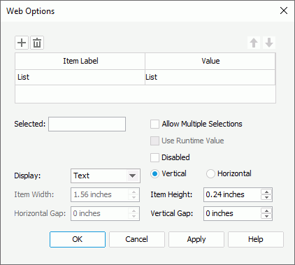
- Specify the item labels and the value of each item in the item box by inputting some strings as the labels and values respectively. If you want to use a DBField, formula field, or parameter field to control the value, select the ellipsis
 in the Value column to insert one using the Insert Fields dialog box, and then select the format for the inserted field from the drop-down list in the Item Label column. Select All in the Insert Field dialog box if you want to add an "All" value to the list/drop-down list. Then when the dashboard users select "All" as value of the list/drop-down list at runtime, all filter actions defined on the list/drop-down list will not take effect, and if you apply some other web action that needs value from the list/drop-down list, JDashboard returns a "Null" value.
 - In the Selected field, specify the selected value for the list/drop-down list.
- Select Disabled if you want to disable the list/drop-down list at runtime.
- For a list web control, you can also specify the following:
- Select Allow Multiple Selections if you want to allow multiple items to be selected in the list.
- Specify to display the list as Text, Button, Checkbox, or Radio Button
- Use the vertical or horizontal layout to display items in the list.
- Specify the width/height of each item and the vertical/horizontal gap between two adjacent items in the list.
- Select OK to finish defining the web options of the list/drop-down list.
- Specify the web behavior of the list/drop-down list.
![]() If you specify a tool tip for a text field or checkbox, on Firefox, the tool tip displays in one line with the maximal tip width the browser allows. Firefox cuts the text that cannot display within the width and replaces it with an ellipsis (...).
If you specify a tool tip for a text field or checkbox, on Firefox, the tool tip displays in one line with the maximal tip width the browser allows. Firefox cuts the text that cannot display within the width and replaces it with an ellipsis (...).
 Previous Topic
 Back to top